What is the starting point for your dissemination work package? At Europa Media, our very first thought is always on branding: creating a familiar and consistent image of the project, so that it is recognisable by all audiences and on all media and devices.
In order to obtain a professional result, you really want to resort to a professional design agency, or competent graphic designer. Although this may affect your budget, costs for dissemination, including the creation of a visual identity, merchandise and other promotional materials, are eligible and can be planned under the category “Other Costs for goods, works and services”, or they can be subcontracted. You should resort to sub-contracting whenever the good, work or service is required to implement a task indicated in your Description of Action. Beware: the price of the subcontracts will not be taken into account for the application of the flat-rate for indirect costs.
At Europa Media, we have an in-house graphic design department, and today I decided to interview the head of this department, Angela, a graphic designer who has been working in EU research and innovation projects since the very beginning of FP7. I hope her experience and tips will inspire you for your next Horizon 2020 project.
What kind of graphic design products are needed in Horizon 2020?
At proposal stage, I usually prepare the PERT diagram and the Gantt chart, showing the interrelations amongst work packages and their timing, and figures for the Management structure, highlighting the overall governance of a project. Sometimes it can also be valuable to create a map of Europe showing the geographical coverage of partners, and mock-ups for specific technical tasks.
The Commission doesn’t require a project logo at this stage, but if there are no time constraints, it can give an additional touch of carefulness.
Once the project starts, the first products I develop for a project are the logo and the visual identity, in cooperation with the project coordinator and with the approval of all partners. Once these are settled, I can further create templates for internal and external communications: Power Point presentations, Word documents for deliverables, and so on. The website design is the next step, realised together with our IT department. According to the different needs and plans of a given project, I design printed dissemination material, such as leaflets, posters, roll outs, business cards, and sometimes more original merchandise or stationary. It really depends on the individual project, its audience and content!
What is the advantage of having a visual identity?
A clear visual identity is key to convey a strong, consistent and unique image of every EU project, increasing the consortium’s ability to communicate their mission, objectives and achievements. Such a visual identity connects all of the project partners together and makes the project more recognisable and understandable by the wider public.
The fact that many different people are often involved in communication activities of a project poses the risk that just as many different images and perceptions will be conveyed of the same project, making it harder for the outside world to recognise the project as one only. For example, if the website design had different colours and design from the printed material, people would never realise it is the same project!

What elements does a visual identity include?
There is no one-size-fits-all visual identity. For Horizon 2020 projects, I usually establish:
- A logo, for which I provide structure, proportions, and its black and white version.
- Fonts to be used both online and on printed materials. A tip: fonts chosen for a project should be free, you cannot really expect people to download or even buy new fonts. Again, there is no rule to choose a font, each project has its own values and conveys different emotions or ideas, so the first question I ask myself is on the style that would best emphasise the project itself; only later I can choose the font accordingly.
- Colour Palette, including a number of colours that will be used for all dissemination and communication purposes. I always use Pantone colours, and provide the CMYK and RGB codes to partners, to make sure there is a clear understanding.
- Templates and examples: within a visual identity, I usually include examples of posters, flyers, roll-outs, websites etc., to better give an idea to partners of what that design will look like on the real materials, and also because sometimes other graphic designers are involved, so it’s a good idea to make sure we are all on the same page.
How do you create a logo?
It’s very important to be completely aware of the project’s objectives and scope, so the starting point for me is to read the proposal and discuss with the project manager what values and impressions the project should convey. I also ask a brief from project managers: a short document with the essential keywords. The personal taste of the individual project manager of course is always crucial – but here I’m lucky! (most of the times :))
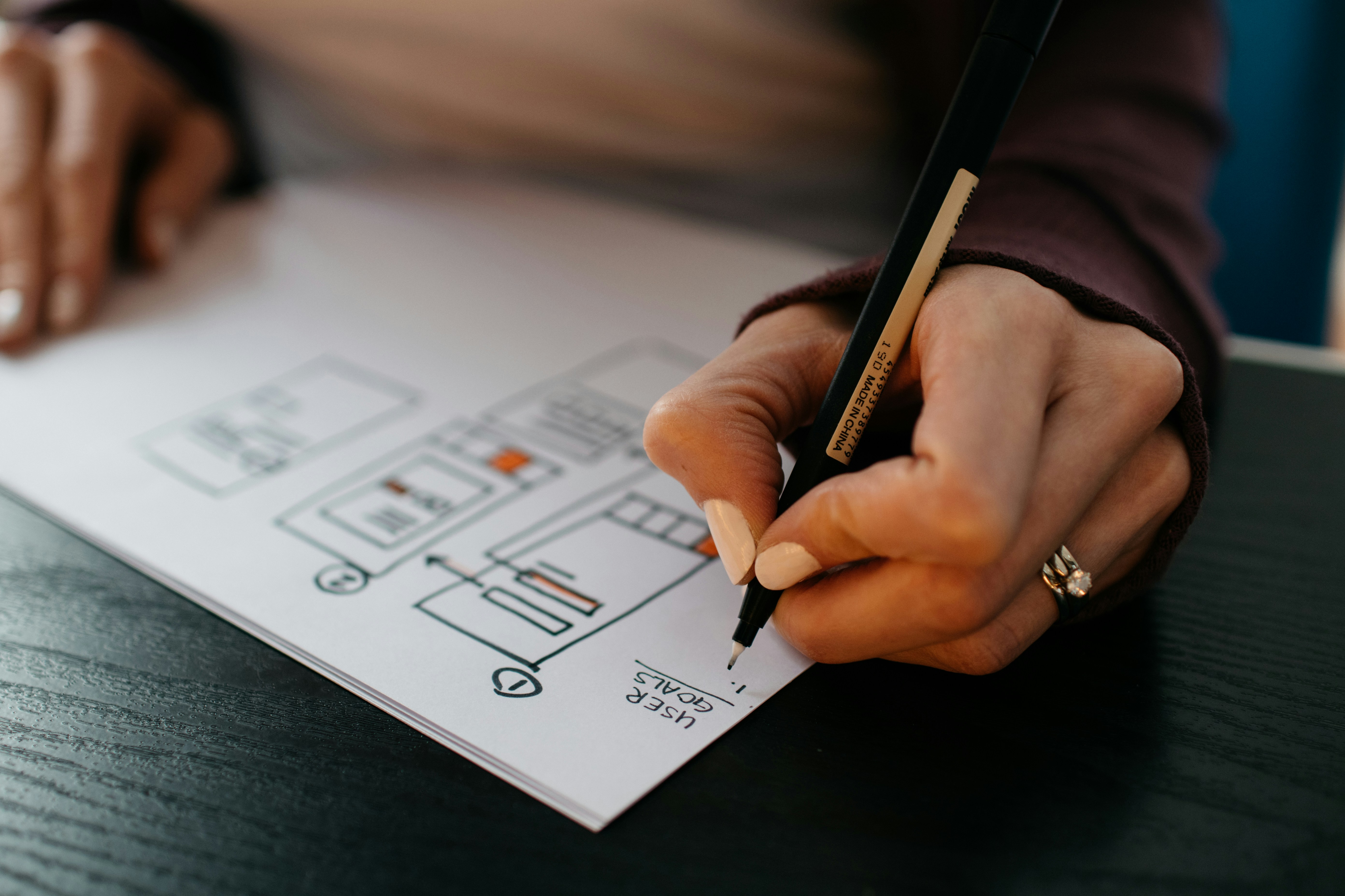
I always start by making some hand-made sketches on paper, then I transfer them into digital format. I create three versions and send them out to the partners – the decision process then depends on the partner responsible for this, and on how easily partners can find an agreement.


How do you choose colours?
They are really related to the topic. For example, I created the visual identity of one of Geonardo’s projects on creating graphene from food waste. The topic was hardcore chemistry, and the main goal was creating something completely innovative and valuable from food waste. So I decided to choose green, which reminds of recycling, and purple, which represents the perfect colour for transitions and transformations; it’s a mystical colour, coming from red and blue together, and allowing very different shades with just small additions of each component.

What about fonts?
I use mostly grotesque fonts, because these are innovative projects and modern fonts fit them better. For example, sans-serif fonts are better for traditional, conservative purposes. But actually in graphic design everything is possible, you can still use serif fonts for modern projects, it’s really up to the designer’s taste!

Are there strict rules for visual identities?
No, there are no strict rules under Horizon 2020, so the designer is totally free. Other grant authorities and schemes sometimes provide strict rules, for example in terms of templates, and designers can only design a logo, but the templates for all dissemination materials and colour palettes are fixed.
What is your favourite task as a graphic designer for EU projects?
Creating a logo is the most creative task, where you can show your own ideas and your own taste. The same applies for the creation of icons, leaflets, and web design!
What are the deepest personal satisfactions in being a graphic designer for EU projects?
Printed material gives me great satisfaction: when materials arrive from the print house and I unpack and check them, it’s a really a magical moment: it’s like unwrapping presents! I feel satisfied because working on these projects has allowed me to create visual messages that are used for many years and help disseminate important messages.

What is the most important thing that a proposal writer or a project manager should know about the use of graphic design under Horizon 2020?
The logo should be really simple and it should have clear quality both in small and large formats, since it will be used on many different formats, from digital to analogue materials. Also, I think it shouldn’t be the visual translation of the project description, but an uncomplicated way of conveying values and ideas, which invites people to learn more about the project and to be involved in it.