On our first post of the ‘Go Visual series’, we told you about the importance of creating engaging visual content. In this second part, we want to talk about how to start when creating a visual identity for your project.
Creating a Project Brand
Why care about your project’s brand? We all know what a brand is, the logo right? Well, not quite… A brand is rather an emotional definition of the reason why a consumer chooses one product/service/project over another. Therefore, your project’s branding can make a huge difference in convincing partners to come on board, spending an extra minute reading what you have to say, or attending one of your events.
We like to look at branding as the action of aligning what we think of us with what our target audiences perceive we are.
How?
We are not going to list here all the elements that you need to include to create the picture-perfect commercial brand but instead, we are going to give you some practical tips that we consider could be useful when thinking about your future project’s brand creation. We’ve separated them by 3 key points:
1. Positioning and Purpose
You should always start by studying the other key players of the industry; by mapping them, analyzing their communication, brand, and purpose, it will be easier to define your competitive opportunity within the market. Once you have defined your accurate competitive positioning within the market, you are putting yourself on that map and deciding where you stand. You do so, according to your brand purpose (the reason you will change the world for the better) and also through the brand identity (the visual representation of the brand). Taking into consideration, of course, that you are going to want to be easily recognized and not to be confused with any of your competitors!
2. Expression
If you think of your project as a person, you can make yourself an idea of what you want it to express: how it sounds like, how it behaves, what it talks about, etc. All these aspects interfere with how we perceive brands and how likeable they result to us. We subconsciously chose those that align better with our taste, values, interest and desires. Again, very emotional!
By defining your tone of voice and expression you should always pay close attention to your target audience and stay as close as possible within their interest and style. Being a scientific project doesn’t mean you should communicate the same way with partners as with the mainstream public. Simple language and visual communication are proven to work way better for larger audiences.
3. Identity
By identity, we like to put ALL visual contact points of the brand: Logo, website design, promotional material design, even the physical appearance of the people working on the project will contribute to the visual identity. All elements should be aligned and work towards one single direction. Defining the visual identity is commonly mistaken as a starting point instead of the result of an investigation of the environment where your brand will coexist.
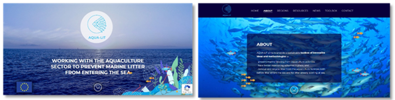
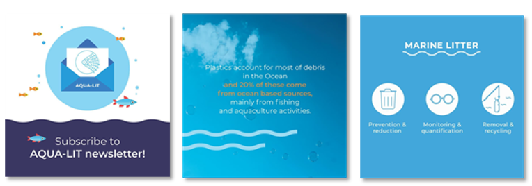
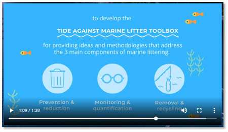
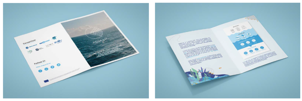
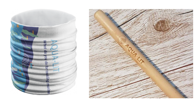
An in-house example could be one of our most recent projects, AQUA-LIT.
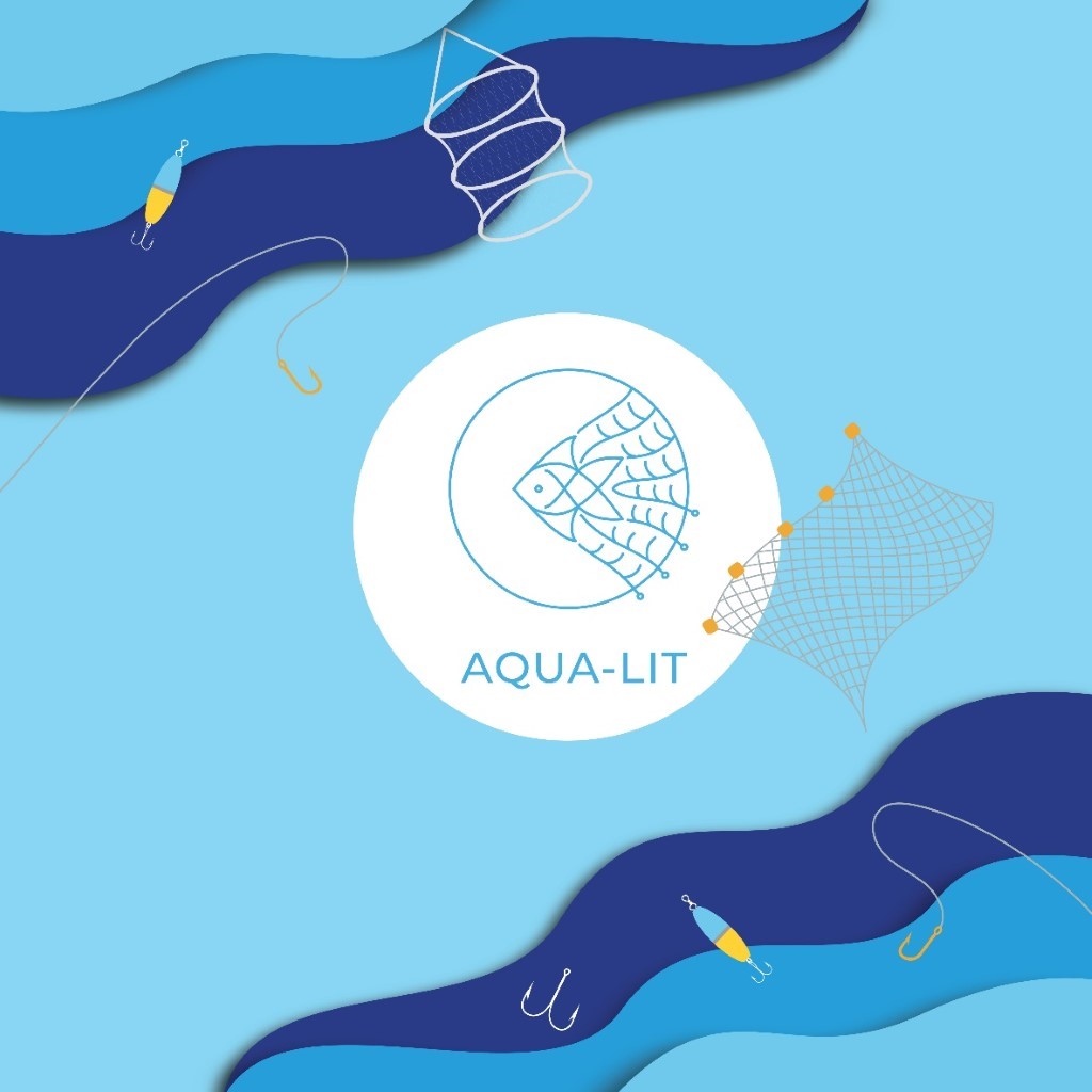
The project is about working with the aquaculture sector to bring solutions that tackle marine litter. Therefore, we have two important things to consider here: trash in the ocean and the aquaculture industry polluting.
The development of the project brand went as follows:
- Positioning and Purpose: All the other projects out there dealing with ocean-based sources of marine litter focus mainly on litter coming from the fisheries sector, or altogether, fisheries and aquaculture. AQUA-LIT distinguishes itself by focusing ONLY on aquaculture, a sector often overlooked.
- Expression: We know we want to target all stakeholders involved in the aquaculture industry, but also use the project to raise awareness in the general public. Therefore, the language must be easy and with not many technicisms. Simple visuals will further help convey all messages.
- Identity: The same palette of colours and type of icons will be used along all products of the project in order to keep an identity easy to recognize by everyone. Example of this is the following material:
Website
Social media posts
Videos
Flyers
Products
Now that you have understood why visual content is so important, and that you have the general idea on how to build your brand guideline, we will share with you in our next and last post of the ‘Go visual series’, our top recommendation of online and -mostly free to use- resources that will boost your visual identity significantly. So, don’t miss it, we ensure you will find it useful!
If you haven't already, check out our other GO VISUAL posts: